Designer Bio
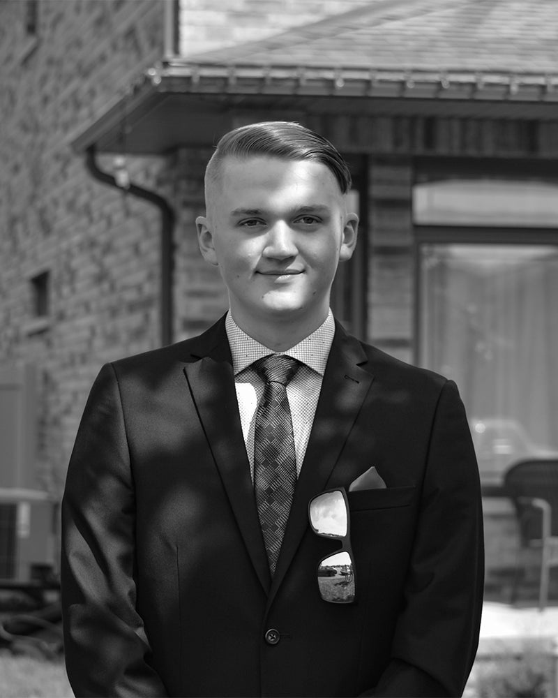
Hello, my name is Matthew Gustavel but I go by Matt. I am a Graphic Designer with real-world client experience. Designing the future is what drives me to be a strategic, creative, problem solver. Most importantly, I am a genuine and positive individual, happy to be helpful to others. My drive to create the unseen thrives especially in branding and package design.
COURSE
Brand Identity Design 2
Objective
The goal of this project was to create a strong brand identity for Northern Youth Abroad that reflects its mission of empowering youth through education, leadership, and travel experiences. The redesign focused on improving scalability, clarity, and relevance while displaying adventure and optimism.
Description
This brand identity redesign modernizes Northern Youth Abroad’s visual presence, ensuring consistency across all platforms. The new logo uses a negative space of the letterforms with integrated orientation arrows, symbolizing direction, growth, and opportunity as well as resembling the northern pin on a compass. A brand guideline book was developed to maintain consistency in logo usage, typography, and visual identity across print and digital media with all users. The result is a more adaptable and memorable brand that aligns with the organization’s values and purpose.


COURSE
Brand Identity Design 1
Objective
This project was aimed at crafting a refined and memorable brand identity for Cricket Café, capturing its charm, authenticity, and strong sense of community. The goal was to create a logo and menu design that would establish a cohesive visual language, reinforcing the café’s warm and elegant atmosphere while remaining practical and scalable.
Description
The logo uses grass as negative space to reference the “Cricket” name while maintaining an appetizing setting. A petite coffee cup enhances the sense of warmth and hospitality, ensuring a strong connection to the café experience.
The menu design uses a sleek, narrow design, adding sophistication. A warm analogous colour scheme, complimentary typography, and a structured two-column format create a brand identity that resonates with the charming, elegant, and community-based personality.


COURSE
Graphic Design 4
Objective
This project focuses on redesigning the packaging for the Fox Outdoor Polarshield Emergency Blanket to enhance its functionality, environmental impact, and market appeal. The goal was to create a more user-friendly, durable, and visually compelling package while maintaining brand recognition and strengthening its connection with military, tactical, and outdoor enthusiasts.
Description
The new package design improves accessibility with easy-open slits for quick use with minimal motor function and uses biodegradable plastic for disposal in any situation. The layout has bold typography, an eye-catching orange and grey color scheme, and icons that instantly communicate key product benefits. A hero image on the front shows the product’s purpose for passersbys.
The accompanying marketing campaign, The Fear of Not Having, emphasizes the importance of preparedness, making outdoor enthusiasts consider the consequences of being unprepared. The redesigned packaging and campaign give the product meaningful touchpoints.


